Chapter 5: Statistics: Describing Data
Learning Outcomes
- Calculate the mean, median, and mode of a set of data
- Calculate the range of a data set, and recognize it’s limitations in fully describing the behavior of a data set
- Calculate the standard deviation for a data set, and determine it’s units
- Identify the difference between population variance and sample variance
- Identify the quartiles for a data set, and the calculations used to define them
- Identify the parts of a five number summary for a set of data, and create a box plot using it
It is often desirable to use a few numbers to summarize a data set. One important aspect of a set of data is where its center is located. In this lesson, measures of central tendency are discussed first. A second aspect of a distribution is how spread out it is. In other words, how much the data in the distribution vary from one another. The second section of this lesson describes measures of variability.
Measures of Central Tendency
Mean, Median, and Mode

Let’s begin by trying to find the most “typical” value of a data set.
Note that we just used the word “typical” although in many cases you might think of using the word “average.” We need to be careful with the word “average” as it means different things to different people in different contexts. One of the most common uses of the word “average” is what mathematicians and statisticians call the arithmetic mean, or just plain old mean for short. “Arithmetic mean” sounds rather fancy, but you have likely calculated a mean many times without realizing it; the mean is what most people think of when they use the word “average.”
You learned how to compute the mean of a set of numbers in Excel. Refer back to Chapter 2 for instructions, if needed. It is perfectly okay to use Excel for these exercises. You can also use the Desmos calculator to compute a mean.
Mean
The mean of a set of data is the sum of the data values divided by the number of values.
examples
Marci’s exam scores for her last math class were 79, 86, 82, and 94. What would the mean of these values would be?
Solution:
Typically we round means to one more decimal place than the original data had. In this case, we would round 85.25 to 85.3.
The number of touchdown (TD) passes thrown by each of the 31 teams in the National Football League in the 2000 season are shown below.
37 33 33 32 29 28 28 23 22 22 22 21 21 21 20
20 19 19 18 18 18 18 16 15 14 14 14 12 12 9 6
What is the mean number of TD passes?
Solution:
Adding these values, we get 634 total TDs. Dividing by 31, the number of data values, we get 634/31 = 20.4516. It would be appropriate to round this to 20.5.
It would be most correct for us to report that “The mean number of touchdown passes thrown in the NFL in the 2000 season was 20.5 passes,” but it is not uncommon to see the more casual word “average” used in place of “mean.”
Remember that you can use Excel to compute the mean.
Both examples are described further in the following video.
Try It
The price of a jar of peanut butter at 5 stores was $3.29, $3.59, $3.79, $3.75, and $3.99. Find the mean price.
examples
The one hundred families in a particular neighborhood are asked their annual household income, to the nearest $5 thousand dollars. The results are summarized in a frequency table below.
| Income (thousands of dollars) | Frequency |
| 15 | 6 |
| 20 | 8 |
| 25 | 11 |
| 30 | 17 |
| 35 | 19 |
| 40 | 20 |
| 45 | 12 |
| 50 | 7 |
What is the mean average income in this neighborhood?
Solution:
Calculating the mean by hand could get tricky if we try to type in all 100 values:
[latex]\frac{\overbrace{15+\cdots+15}^{\text{6terms}}+\overbrace{20+\cdots+20}^{\text{8terms}}+\overbrace{25+\cdots+25}^{\text{11terms}}+\cdots}{\text{100}}[/latex]
We could calculate this more easily by noticing that adding 15 to itself six times is the same as = 90. Using this simplification, we get
[latex]\frac{15\cdot6+20\cdot8+25\cdot11+30\cdot17+35\cdot19+40\cdot20+45\cdot12+50\cdot7}{\text{100}}=\frac{3390}{100}=33.9[/latex]
The mean household income of our sample is 33.9 thousand dollars ($33,900).
Extending off the last example, suppose a new family moves into the neighborhood example that has a household income of $5 million ($5000 thousand).
What is the new mean of this neighborhood’s income?
Solution:
Adding this to our sample, our mean is now:
[latex]\frac{15\cdot6+20\cdot8+25\cdot11+30\cdot17+35\cdot19+40\cdot20+45\cdot12+50\cdot7+5000\cdot1}{\text{101}}=\frac{8390}{101}=83.069[/latex]
Both situations are explained further in this video.
While 83.1 thousand dollars ($83,069) is the correct mean household income, it no longer represents a “typical” value.
Imagine the data values on a see-saw or balance scale. The mean is the value that keeps the data in balance, like in the picture below.

If we graph our household data, the $5 million data value is so far out to the right that the mean has to adjust up to keep things in balance.

For this reason, when working with data that have outliers – values far outside the primary grouping – it is common to use a different measure of center, the median.
Median
The median of a set of data is the value in the middle when the data is in order.
- To find the median, begin by listing the data in order from smallest to largest, or largest to smallest.
- If the number of data values, N, is odd, then the median is the middle data value. This value can be found by rounding N/2 up to the next whole number.
- If the number of data values is even, there is no one middle value, so we find the mean of the two middle values (values N/2 and N/2 + 1)
You may also use Excel to find the median of the data. Enter your data in a column, then use the command, =MEDIAN. You will need to select your data, just like you would do to find the mean of the data.
example
Returning to the football touchdown data, we would start by listing the data in order. Luckily, it was already in decreasing order, so we can work with it without needing to reorder it first.
37 33 33 32 29 28 28 23 22 22 22 21 21 21 20
20 19 19 18 18 18 18 16 15 14 14 14 12 12 9 6
What is the median TD value?
Solution:
Since there are 31 data values, an odd number, the median will be the middle number, the 16th data value (31/2 = 15.5, round up to 16, leaving 15 values below and 15 above). The 16th data value is 20, so the median number of touchdown passes in the 2000 season was 20 passes. Notice that for this data, the median is fairly close to the mean we calculated earlier, 20.5.[/hidden-answer]
Find the median of these quiz scores: 5 10 8 6 4 8 2 5 7 7
Solution:
We start by listing the data in order: 2 4 5 5 6 7 7 8 8 10
Since there are 10 data values, an even number, there is no one middle number. So we find the mean of the two middle numbers, 6 and 7, and get (6+7)/2 = 6.5.
The median quiz score was 6.5.
Learn more about these median examples in this video. Note that you may also use Excel to find the median in these problems.
Try It
The price of a jar of peanut butter at 5 stores was $3.29, $3.59, $3.79, $3.75, and $3.99. Find the median price.
Example
Let us return now to our original household income data
| Income (thousands of dollars) | Frequency |
| 15 | 6 |
| 20 | 8 |
| 25 | 11 |
| 30 | 17 |
| 35 | 19 |
| 40 | 20 |
| 45 | 12 |
| 50 | 7 |
What is the mean of this neighborhood’s household income?
Solution:
Here we have 100 data values. If we didn’t already know that, we could find it by adding the frequencies. Since 100 is an even number, we need to find the mean of the middle two data values – the 50th and 51st data values. To find these, we start counting up from the bottom:
There are 6 data values of $15, so Values 1 to 6 are $15 thousand
The next 8 data values are $20, so Values 7 to (6+8)=14 are $20 thousand
The next 11 data values are $25, so Values 15 to (14+11)=25 are $25 thousand
The next 17 data values are $30, so Values 26 to (25+17)=42 are $30 thousand
The next 19 data values are $35, so Values 43 to (42+19)=61 are $35 thousand
From this we can tell that values 50 and 51 will be $35 thousand, and the mean of these two values is $35 thousand. The median income in this neighborhood is $35 thousand.
If we add in the new neighbor with a $5 million household income, then there will be 101 data values, and the 51st value will be the median. As we discovered in the last example, the 51st value is $35 thousand. Notice that the new neighbor did not affect the median in this case. The median is not swayed as much by outliers as the mean is.
View more about the median of this neighborhood’s household incomes here.
In addition to the mean and the median, there is one other common measurement of the “typical” value of a data set: the mode.
Mode
The mode is the element of the data set that occurs most frequently.
The mode is fairly useless with data like weights or heights where there are a large number of possible values. The mode is most commonly used for categorical (or qualitative) data, for which median and mean cannot be computed.
Sometimes a data set may have more than one number that occurs most frequently. Then the data is considered to be multi-modal. Because a data set could have more than one mode, you do not want to use the Excel command for mode. It will only find the first mode in multi-modal data.
Example
In our vehicle color survey earlier in this section, we collected the data
| Color | Frequency |
|---|---|
| Blue | 3 |
| Green | 5 |
| Red | 4 |
| White | 3 |
| Black | 2 |
| Grey | 3 |
Which color is the mode?
[reveal-answer q=”638793″]Show Solution[/reveal-answer]
[hidden-answer a=”638793″]For this data, Green is the mode, since it is the data value that occurred the most frequently.[/hidden-answer]
Mode in this example is explained by the video here.
It is possible for a data set to have more than one mode if several categories have the same frequency, or no modes if each every category occurs only once.
Try It
Reviewers were asked to rate a product on a scale of 1 to 5. Find
- The mean rating
- The median rating
- The mode rating
| Rating | Frequency |
| 1 | 4 |
| 2 | 8 |
| 3 | 7 |
| 4 | 3 |
| 5 | 1 |
Measures of Variation
Range and Standard Deviation
Consider these three sets of quiz scores:
Section A: 5 5 5 5 5 5 5 5 5 5
Section B: 0 0 0 0 0 10 10 10 10 10
Section C: 4 4 4 5 5 5 5 6 6 6
All three of these sets of data have a mean of 5 and median of 5, yet the sets of scores are clearly quite different. In section A, everyone had the same score; in section B half the class got no points and the other half got a perfect score, assuming this was a 10-point quiz. Section C was not as consistent as section A, but not as widely varied as section B.
In addition to the mean and median, which are measures of the “typical” or “middle” value, we also need a measure of how “spread out” or varied each data set is.
There are several ways to measure this “spread” of the data. The first is the simplest and is called the range.
Range
The range is the difference between the maximum value and the minimum value of the data set.
example
Using the quiz scores from above,
For section A, the range is 0 since both maximum and minimum are 5 and 5 – 5 = 0
For section B, the range is 10 since 10 – 0 = 10
For section C, the range is 2 since 6 – 4 = 2
In the last example, the range seems to be revealing how spread out the data is. However, suppose we add a fourth section, Section D, with scores 0 5 5 5 5 5 5 5 5 10.
This section also has a mean and median of 5. The range is 10, yet this data set is quite different than Section B. To better illuminate the differences, we’ll have to turn to more sophisticated measures of variation.
The range of this example is explained in the following video.
Standard deviation
The standard deviation is a measure of variation based on measuring how far each data value deviates, or is different, from the mean. A few important characteristics:
- Standard deviation is always positive. Standard deviation will be zero if all the data values are equal, and will get larger as the data spreads out.
- Standard deviation has the same units as the original data.
- Standard deviation, like the mean, can be highly influenced by outliers.
Computing standard deviation by hand is a complex process, with many possibilities for little errors that can throw off your final answer. It is perfectly fine to use Excel to compute standard deviation. List all of your values in a column, like you would do to compute the mean or the median, but instead of those commands, use =STDEV.S or =STDEV. Do not use =STDEV.P, which is meant for entire populations.
Here are the directions for computing standard deviation by hand. It is always good to try it once, or at least read through the process:
Using the data from section D, we could compute for each data value the difference between the data value and the mean:
| data value | deviation: data value – mean |
|---|---|
| 0 | 0-5 = -5 |
| 5 | 5-5 = 0 |
| 5 | 5-5 = 0 |
| 5 | 5-5 = 0 |
| 5 | 5-5 = 0 |
| 5 | 5-5 = 0 |
| 5 | 5-5 = 0 |
| 5 | 5-5 = 0 |
| 5 | 5-5 = 0 |
| 10 | 10-5 = 5 |
We would like to get an idea of the “average” deviation from the mean, but if we find the average of the values in the second column the negative and positive values cancel each other out (this will always happen), so to prevent this we square every value in the second column:
| data value | deviation: data value – mean | deviation squared |
|---|---|---|
| 0 | 0-5 = -5 | (-5)2 = 25 |
| 5 | 5-5 = 0 | 02 = 0 |
| 5 | 5-5 = 0 | 02 = 0 |
| 5 | 5-5 = 0 | 02 = 0 |
| 5 | 5-5 = 0 | 02 = 0 |
| 5 | 5-5 = 0 | 02 = 0 |
| 5 | 5-5 = 0 | 02 = 0 |
| 5 | 5-5 = 0 | 02 = 0 |
| 5 | 5-5 = 0 | 02 = 0 |
| 10 | 10-5 = 5 | (5)2 = 25 |
We then add the squared deviations up to get 25 + 0 + 0 + 0 + 0 + 0 + 0 + 0 + 0 + 25 = 50. Ordinarily we would then divide by the number of scores, n, (in this case, 10) to find the mean of the deviations. But we only do this if the data set represents a population; if the data set represents a sample (as it almost always does), we instead divide by n – 1 (in this case, 10 – 1 = 9).[1]
So in our example, we would have 50/10 = 5 if section D represents a population and 50/9 = about 5.56 if section D represents a sample. These values (5 and 5.56) are called, respectively, the population variance and the sample variance for section D.
Variance can be a useful statistical concept, but note that the units of variance in this instance would be points-squared since we squared all of the deviations. What are points-squared? Good question. We would rather deal with the units we started with (points in this case), so to convert back we take the square root and get:
[latex]\begin{align}&\text{populationstandarddeviation}=\sqrt{\frac{50}{10}}=\sqrt{5}\approx2.2\\&\text{or}\\&\text{samplestandarddeviation}=\sqrt{\frac{50}{9}}\approx2.4\\\end{align}[/latex]
If we are unsure whether the data set is a sample or a population, we will usually assume it is a sample, and we will round answers to one more decimal place than the original data, as we have done above.
To compute standard deviation by hand
- Find the deviation of each data from the mean. In other words, subtract the mean from the data value.
- Square each deviation.
- Add the squared deviations.
- Divide by n, the number of data values, if the data represents a whole population; divide by n – 1 if the data is from a sample.
- Compute the square root of the result.
example
Computing the standard deviation for Section B above, we first calculate that the mean is 5. Using a table can help keep track of your computations for the standard deviation:
| data value | deviation: data value – mean | deviation squared |
|---|---|---|
| 0 | 0-5 = -5 | (-5)2 = 25 |
| 0 | 0-5 = -5 | (-5)2 = 25 |
| 0 | 0-5 = -5 | (-5)2 = 25 |
| 0 | 0-5 = -5 | (-5)2 = 25 |
| 0 | 0-5 = -5 | (-5)2 = 25 |
| 10 | 10-5 = 5 | (5)2 = 25 |
| 10 | 10-5 = 5 | (5)2 = 25 |
| 10 | 10-5 = 5 | (5)2 = 25 |
| 10 | 10-5 = 5 | (5)2 = 25 |
| 10 | 10-5 = 5 | (5)2 = 25 |
Assuming this data represents a population, we will add the squared deviations, divide by 10, the number of data values, and compute the square root:
[latex]\sqrt{\frac{25+25+25+25+25+25+25+25+25+25}{10}}=\sqrt{\frac{250}{10}}=5[/latex]
Notice that the standard deviation of this data set is much larger than that of section D since the data in this set is more spread out.
For comparison, the standard deviations of all four sections are:
| Section A: 5 5 5 5 5 5 5 5 5 5 | Standard deviation: 0 |
| Section B: 0 0 0 0 0 10 10 10 10 10 | Standard deviation: 5 |
| Section C: 4 4 4 5 5 5 5 6 6 6 | Standard deviation: 0.8 |
| Section D: 0 5 5 5 5 5 5 5 5 10 | Standard deviation: 2.2 |
See the following video for more about calculating the standard deviation in this example by hand. Again, it is perfectly okay to use Excel to find the standard deviation.
Try It
The price of a jar of peanut butter at 5 stores was $3.29, $3.59, $3.79, $3.75, and $3.99. Find the standard deviation of the prices.
Where standard deviation is a measure of variation based on the mean, quartiles are based on the median.
There are a number of different ways to compute quartiles, and each method results, sometimes, in slightly different answers. Excel does have a command for quartiles, but you will not always get the same answer as you will following the procedure below, so this is one instance where you will want to follow the instructions given here.
Quartiles
Quartiles are values that divide the data in quarters.
The first quartile (Q1) is the value so that 25% of the data values are below it; the third quartile (Q3) is the value so that 75% of the data values are below it. You may have guessed that the second quartile is the same as the median, since the median is the value so that 50% of the data values are below it.
This divides the data into quarters; 25% of the data is between the minimum and Q1, 25% is between Q1 and the median, 25% is between the median and Q3, and 25% is between Q3 and the maximum value.
While quartiles are not a 1-number summary of variation like standard deviation, the quartiles are used with the median, minimum, and maximum values to form a 5 number summary of the data.
Five number summary
The five number summary takes this form:
Minimum, Q1, Median, Q3, Maximum
To find the first quartile, we need to find the data value so that 25% of the data is below it. If n is the number of data values, we compute a locator by finding 25% of n. If this locator is a decimal value, we round up, and find the data value in that position. If the locator is a whole number, we find the mean of the data value in that position and the next data value. This is identical to the process we used to find the median, except we use 25% of the data values rather than half the data values as the locator.
To find the first quartile, Q1
- Begin by ordering the data from smallest to largest
- Compute the locator: L = 0.25n
- If L is a decimal value:
- Round up to L+
- Use the data value in the L+th position
- If L is a whole number:
- Find the mean of the data values in the Lth and L+1th positions.
To find the third quartile, Q3
Use the same procedure as for Q1, but with locator: L = 0.75n
Examples should help make this clearer.
examples
Suppose we have measured 9 females, and their heights (in inches) sorted from smallest to largest are:
59 60 62 64 66 67 69 70 72
What are the first and third quartiles?
Solution:
To find the first quartile we first compute the locator: 25% of 9 is L = 0.25(9) = 2.25. Since this value is not a whole number, we round up to 3. The first quartile will be the third data value: 62 inches.
To find the third quartile, we again compute the locator: 75% of 9 is 0.75(9) = 6.75. Since this value is not a whole number, we round up to 7. The third quartile will be the seventh data value: 69 inches.
Suppose we had measured 8 females, and their heights (in inches) sorted from smallest to largest are:
59 60 62 64 66 67 69 70
What are the first and third quartiles? What is the 5 number summary?
Solution:
To find the first quartile we first compute the locator: 25% of 8 is L = 0.25(8) = 2. Since this value is a whole number, we will find the mean of the 2nd and 3rd data values: (60+62)/2 = 61, so the first quartile is 61 inches.
The third quartile is computed similarly, using 75% instead of 25%. L = 0.75(8) = 6. This is a whole number, so we will find the mean of the 6th and 7th data values: (67+69)/2 = 68, so Q3 is 68.
Note that the median could be computed the same way, using 50%.
The 5-number summary combines the first and third quartile with the minimum, median, and maximum values.
What are the 5-number summaries for each of the previous 2 examples?
Solution:
For the 9 female sample, the median is 66, the minimum is 59, and the maximum is 72. The 5 number summary is: 59, 62, 66, 69, 72.
For the 8 female sample, the median is 65, the minimum is 59, and the maximum is 70, so the 5 number summary would be: 59, 61, 65, 68, 70.
More about each set of women’s heights is in the following videos.
Returning to our quiz score data: in each case, the first quartile locator is 0.25(10) = 2.5, so the first quartile will be the 3rd data value, and the third quartile will be the 8th data value. Creating the five-number summaries:
| Section and data | 5-number summary |
| Section A: 5 5 5 5 5 5 5 5 5 5 | 5, 5, 5, 5, 5 |
| Section B: 0 0 0 0 0 10 10 10 10 10 | 0, 0, 5, 10, 10 |
| Section C: 4 4 4 5 5 5 5 6 6 6 | 4, 4, 5, 6, 6 |
| Section D: 0 5 5 5 5 5 5 5 5 10 | 0, 5, 5, 5, 10 |
Of course, with a relatively small data set, finding a five-number summary is a bit silly, since the summary contains almost as many values as the original data.
A video walkthrough of this example is available below.
Try It
The total cost of textbooks for the term was collected from 36 students. Find the 5 number summary of this data.
$140 $160 $160 $165 $180 $220 $235 $240 $250 $260 $280 $285
$285 $285 $290 $300 $300 $305 $310 $310 $315 $315 $320 $320
$330 $340 $345 $350 $355 $360 $360 $380 $395 $420 $460 $460
Example
Returning to the household income data from earlier in the section, create the five-number summary.
| Income (thousands of dollars) | Frequency |
| 15 | 6 |
| 20 | 8 |
| 25 | 11 |
| 30 | 17 |
| 35 | 19 |
| 40 | 20 |
| 45 | 12 |
| 50 | 7 |
Solution:
By adding the frequencies, we can see there are 100 data values represented in the table. In Example 20, we found the median was $35 thousand. We can see in the table that the minimum income is $15 thousand, and the maximum is $50 thousand.
To find Q1, we calculate the locator: L = 0.25(100) = 25. This is a whole number, so Q1 will be the mean of the 25th and 26th data values.
Counting up in the data as we did before,
There are 6 data values of $15, so Values 1 to 6 are $15 thousand
The next 8 data values are $20, so Values 7 to (6+8)=14 are $20 thousand
The next 11 data values are $25, so Values 15 to (14+11)=25 are $25 thousand
The next 17 data values are $30, so Values 26 to (25+17)=42 are $30 thousand
The 25th data value is $25 thousand, and the 26th data value is $30 thousand, so Q1 will be the mean of these: (25 + 30)/2 = $27.5 thousand.
To find Q3, we calculate the locator: L = 0.75(100) = 75. This is a whole number, so Q3 will be the mean of the 75th and 76th data values. Continuing our counting from earlier,
The next 19 data values are $35, so Values 43 to (42+19)=61 are $35 thousand
The next 20 data values are $40, so Values 61 to (61+20)=81 are $40 thousand
Both the 75th and 76th data values lie in this group, so Q3 will be $40 thousand.
Putting these values together into a five-number summary, we get: 15, 27.5, 35, 40, 50
This example is demonstrated in this video.
Note that the 5 number summary divides the data into four intervals, each of which will contain about 25% of the data. In the previous example, that means about 25% of households have income between $40 thousand and $50 thousand.
For visualizing data, there is a graphical representation of a 5-number summary called a box plot, or box and whisker graph.
Box plot
A box plot is a graphical representation of a five-number summary.
To create a box plot, a number line is first drawn. A box is drawn from the first quartile to the third quartile, and a line is drawn through the box at the median. “Whiskers” are extended out to the minimum and maximum values.
examples
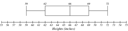
The box plot below is based on the 9 female height data with 5 number summary:
59, 62, 66, 69, 72.
The box plot below is based on the household income data with 5 number summary:
15, 27.5, 35, 40, 50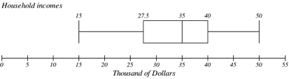
Box plot creation is described further here.
Try It
Create a box plot based on the textbook price data from the last Try It.
Box plots are particularly useful for comparing data from two populations.
examples
The box plot of service times for two fast-food restaurants is shown below.
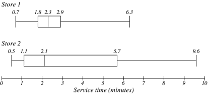
While store 2 had a slightly shorter median service time (2.1 minutes vs. 2.3 minutes), store 2 is less consistent, with a wider spread of the data.
At store 1, 75% of customers were served within 2.9 minutes, while at store 2, 75% of customers were served within 5.7 minutes.
Which store should you go to in a hurry?
Solution:
That depends upon your opinions about luck – 25% of customers at store 2 had to wait between 5.7 and 9.6 minutes.
The box plot below is based on the birth weights of infants with severe idiopathic respiratory distress syndrome (SIRDS)[2]. The box plot is separated to show the birth weights of infants who survived and those that did not.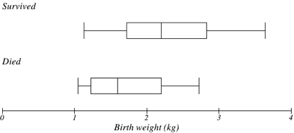
Comparing the two groups, the box plot reveals that the birth weights of the infants that died appear to be, overall, smaller than the weights of infants that survived. In fact, we can see that the median birth weight of infants that survived is the same as the third quartile of the infants that died.
Similarly, we can see that the first quartile of the survivors is larger than the median weight of those that died, meaning that over 75% of the survivors had a birth weight larger than the median birth weight of those that died.
Looking at the maximum value for those that died and the third quartile of the survivors, we can see that over 25% of the survivors had birth weights higher than the heaviest infant that died.
The box plot gives us a quick, albeit informal, way to determine that birth weight is quite likely linked to survival of infants with SIRDS.
The following video analyzes the examples above.
Attributions
This chapter contains material taken from Math in Society (on OpenTextBookStore) by David Lippman, and is used under a CC Attribution-Share Alike 3.0 United States (CC BY-SA 3.0 US) license.
This chapter contains material taken from of Math for the Liberal Arts (on Lumen Learning) by Lumen Learning, and is used under a CC BY: Attribution license.
- The reason we do this is highly technical, but we can see how it might be useful by considering the case of a small sample from a population that contains an outlier, which would increase the average deviation: the outlier very likely won't be included in the sample, so the mean deviation of the sample would underestimate the mean deviation of the population; thus we divide by a slightly smaller number to get a slightly bigger average deviation. ↵
- van Vliet, P.K. and Gupta, J.M. (1973) Sodium bicarbonate in idiopathic respiratory distress syndrome. Arch. Disease in Childhood, 48, 249–255. As quoted on http://openlearn.open.ac.uk/mod/oucontent/view.php?id=398296§ion=1.1.3 ↵
